Do you have a vision that will change everything? Tell us about it!
Re:Rzeszów Festival vol.2
Re:Rzeszów Festival vol.2
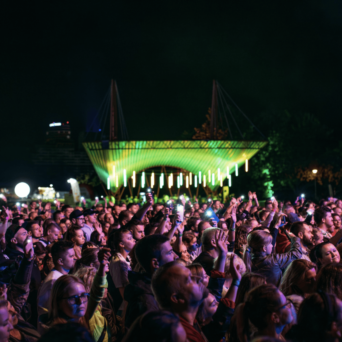
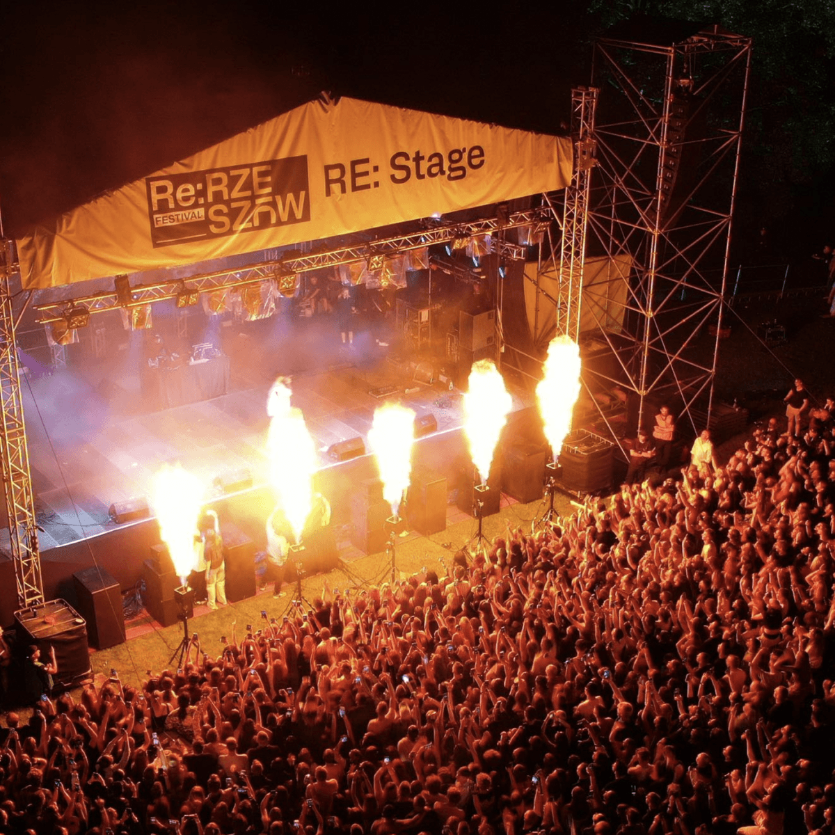
The second edition of a unique musical event, in the very heart of Rzeszów, on the Wisłokem Boulevards.
The second edition of a unique musical event, in the very heart of Rzeszów, on the Wisłokem Boulevards.
key visual
|
branding

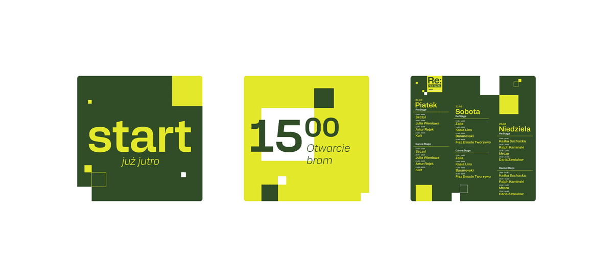
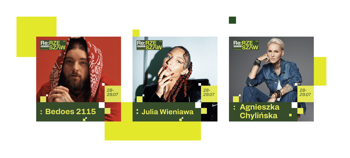
The power of colours
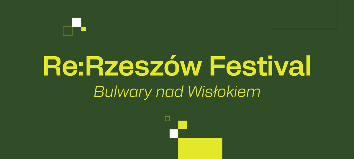
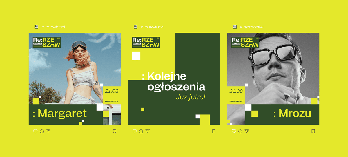
The design colour scheme is a key element that adds character to the festival. Our colour palette focuses on three main colours: neon yellow, dark green and white. Neon yellow is a real explosion of energy that permeates from both the audience and the artists on stage. Dark green, on the other hand, is a tribute to the surrounding park in which the festival takes place. This colour evokes nature, tranquillity and the green of the trees, creating a harmonious contrast when combined with the energetic yellow neon. White acts as a neutral background that emphasises the intensity of the yellow neon and the balance of the greenery. It is the colour of purity and openness, which emphasises the unique character of RE: Rzeszów Festival. Thanks to this colour scheme, our project comes to life, creating an unforgettable atmosphere that captures both the energy of the festival and its close relationship with the surrounding nature.
